nook initial impressions

My birthday present to myself arrived yesterday: the new Barnes & Noble “nook” ebook reader.

As you probably know, ebooks and ebook readers have been a hobby of mine for a while now. I’m rather passionate about ebooks. So of course I had to get a nook to see how it stacks up.

nook

Design

The look of the nook is great. The front is smooth slightly glossy plastic, with a matte finish on the buttons on either side of the screen. The back is a slightly rubberized plastic that feels comfortable in my hand. The weight feels good, and it feels sturdy overall (though I wouldn’t want to drop it). The buttons don’t have seams, and have a nice click to them. The buttons are on both the left and right edges, so it’s good for left or right handed use.

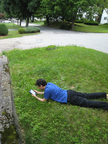
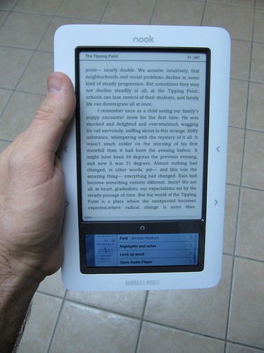
The side buttons do have one major flaw in my mind – they are reversed. When I hold the nook, my hand is comfortable gripping it by the side, with my fingers on the back and my thumb resting on the edge. But my thumb rests on the upper button, which is the “previous page” button. To go to the next page, I have to bend my thumb down every time, which is uncomfortable, or hold the nook by the bottom edge, which is also less comfortable. Lying on my side in bed, I found myself holding the nook with one hand and tapping the “next page” button with my other hand, obviously not ideal.

This button issue isn’t a dealbreaker, but it’s such a basic error it makes me wonder what sort of person tested it – after holding it for one minute, my conclusion was that the “next” and “previous” buttons should be switched.

The screens

The e-ink screen looks great, same e-ink technology as in the Sony and Amazon devices. It has a gray tone to it, nowhere near as white as paper, but is very easy to read. No built-in light source, so you’ll need a reading lamp or some sunlight, same as a paper book.

As with other e-ink screens, the screen takes about a half-second to refresh, and does it with a sort of a blink, which some people find offputting. I’ve never had an issue with it, I find e-ink very easy to read from.

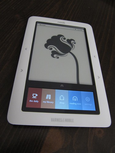
The nook’s particular hook is the second screen, a small LCD touchscreen. I found the initial brightness of this screen way too high, especially next to the non-light-emitting e-ink screen, so I turned the LCD way down, to 7% brightness.

This screen is an interesting workaround to the slow refresh rate of the e-ink, and not cluttering up the device with lots of buttons, like the Kindle. In fact, all three major ebook makers have their own solution for interactivity: Sony has a touchscreen surface overlayed on the e-ink screen, which some say makes the screen harder to read; Amazon has a physical keyboard; Barnes&Noble has the small LCD touchscreen.

The LCD looks good, but is somewhat unresponsive. Using it as an on-screen keyboard works fine, but scrolling vertically through the iPod-style menus is clunky. As an iPhone user I am used to the buttery-smooth scrolling of the Apple device, in comparison the nook’s touchscreen is barely working. It seems more like a software issue than a hardware one, so I’m hoping they can make it respond more smoothly with an update at some point. Right now though, it’s very clunky.

The store

The B&N store on the nook is obviously a first attempt. It’s not terribly well-designed, and in a lot of ways seems broken.

First and foremost, navigation is bad. Just going to “ebooks” gives a result something like “Page 1 (items 1-20 of 30,000)”. While I’m sure B&N wants to show off how many books they have available, putting them all in one long list (with no apparent order to it) is absurd, who is going to page through thousands of screens of random books?

Going to a category isn’t much better, I went to “reference” and the books there seemed to be random as well, there were things like “The Adventures of Sherlock Holmes” in there. In fact, most of them seemed to be fiction, not reference. So whoever categorized these (or wrote the category code) did a terrible job.

I think right now browsing the store is pretty unusable, I didn’t try searching for a specific book, but that’d probably be the best bet for locating content.

Overall

The nook is a nice little device. I really like the feel of it and the design, aside from the flaws mentioned above. It seems like most of the issues are software ones, so it remains to be seen how aggressive B&N will be in doing updates. If they step up and work hard, they could rival Amazon. If they sit back, I think they’re going to lose out.
nook

Manga and Comics on Sony Reader

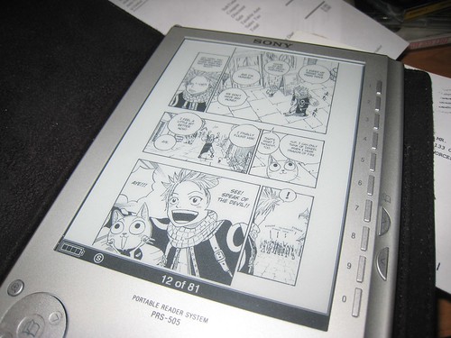
manga on Sony eBook reader

The last couple days I’ve discovered how to put comics and manga on my ebook reader.

There are not a lot of sources for legal comics and manga (the Sony eBook store has a handful of titles, mostly just a few that came out at the launch of the store and hasn’t been updated since). However, there are lots of sources for technically illegal (scans of books) and quasi-legal (fan english translations of scanned japanese books, out-of-print comics whose publishers are no longer in business) sources of comics and manga.

To be honest, I’d be willing to (and have) purchase legal copies, but most publishers are unwilling to provide comics in digital form, or do so in a restrictive form, like limiting viewing to special software on a computer only. So they simply aren’t interested in providing digital content.

Thankfully, there are lots of comics fans out there scanning and posting. A few searches on Google should yield you a wealth of golden-age comics and manga titles.

To put manga and comics on the Sony PRS-505:

1. Download .zip of a manga book (or create a zip of sequentially named .jpgs)
2. rename the .zip to .cbz
3. Drag the .cbz file into Calibre (free, cross-platform app: http://calibre.kovidgoyal.net/download).
4. Click "Convert" in Calibre to convert it to an .lrf file. Leave all the Calibre settings at default except check "Keep Aspect Ratio" otherwise it will be stretched to fill the screen.
4. Copy the .lrf file onto your reader or onto an SD card or memory stick and put that in your reader.
5. enjoy!

Caveat:
In some cases MacOS creates metadata files that may trip up Calibre. To remove metadata files, copy the files in the command line like this:

cp -X /path/to/original/folder/* /path/to/cleanup/folder

The -X switch will prevent extended attributes from being copied.

More detailed info:
Metadata on OSX is stored in hidden files that start with ._ so if you download an image from a webbrowser called "page_01.jpg", an invisible file called "._page_01.jpg" will also be created, which may contain info like the fact the image was downloaded from the internet, and the URL it came from. This is how OSX knows to warn you the first time you try to run an application downloaded from the internet.

Analog Man in the Digital Age

Analog Man in the Digital Age
-or-
The Engineer’s Dilemma

Being a Somewhat Rambling Musing on the Information Age


We live in an interesting time. We have come out of the Industrial Age and into the Information Age. More and more the world is connected digitally, but paradoxically, people feel more lost than ever.

Partly, this is caused by a disconnect between the analog and digital world, and a loss of tangibility and analog character.

Let’s take the example of a letter. In the old days (not so long ago) a letter would be written by hand, pen to paper. Then came the typewriter, and here is where the engineer’s dilemma comes in to play. The typewriter, when it comes to the task of conveying text, is vastly superior to handwriting. It is far more legible and consistent than handwriting. From an engineer’s perspective, it is a better solution to the problem of how to record text. It’s pretty black and white, there are a number of advantages to type over handwriting, from an engineering perspective.

But there is a sterility, a loss of analog character, that takes place when transitioning from handwriting to type. The essence of the message is intact, but the flavor of it, the subtle changes in handwriting, the ability for non-linear writing, the insertion of non-textual doodles, the feel of the line quality from pen or quill as ink grows lower, all that is lost.

Take that to the next stage, and the typewritten letter becomes an email. In that transition, the look is more or less the same, black type on a white surface. From an engineering perspective, the gains are substantial. By making the information digital, it can be transmitted nearly instantaneously anywhere in the world, copied to other locations for redundant backups, and indexed and searched easily. But here, there is also a loss of analog character. The transition from paper to screen has come at a cost of tangibility.

This is more substantial than it might seem, because we are analog animals, and all of our senses are important to us. For example, a letter might have a scent, applied either accidentally or intentionally by the sender, which not only relays sensation to the recipient, but also helps form stronger memories. In an email the physical form is gone, which to means not only a loss of tactile sensation (the thickness of the paper, the flipping from page to page) but also a loss of potential context.

Emails are usually always read in the same place: while sitting at one’s computer. A letter is received at the same place, the mailbox, but might be opened and read in any number of places. This loss of context removes potential context that could form more meaningful memories, such as reading a letter from your lover while sitting at a kitchen table, the sunlight glinting in and the smell of fresh-baked muffins in the air, or reading the same letter while on a noisy crowded subway on the way to work. Memories are more solidly formed when they are associated with all senses at once, and can be triggered in the future by stimulus to any of those senses. In the subway example, years later you might be on a train, and the swaying motion might suddenly bring back the memory of reading that letter, and bring a wistful smile to your face. By homogenizing the letter-reading experience, each email is much less likely to have unique environmental context, or indeed much content beyond purely visual.

Digital content is generally higher-quality than analog content at this point (from the view of production value and perceived “professional” quality), it is slicker and better produced. In a few clicks, a person can create a pleasing slide show of high-quality images. But it is the analog character, the “fiddly bits” that makes people yearn for an old photo album, with photos stuck in slightly crooked, and handwritten notes on the backs. “Scapbooking” is a hyper-extension of this analog character, and the abundance of textures and visuals, the crunchy analog feel, has made this hobby incredibly popular.

So this is the engineer’s dilemma: how to preserve the analog feel in a digital world?

Arthur C. Clarke once famously said “sufficiently advanced technology is indistinguishable from magic” – and this is one place that engineers can look. Engineers are technology-minded, so will most often look forward for solutions.

An example of this is the digital picture frame. It takes the intangible digital photos on your computer and places them in a tangible item. Displayed on the digital frame, the picture can be used in an analog way, it can be picked up, brought closer for examination, and carried around. As technology improves, it could become more and more analog, to the point where the frame could be the size of a polaroid, and a special pen could be used to write on the photo and on the back of the photo, and calling up a particular image would call up the handwritten notes as well. It will essentially become a magic polaroid, almost exactly like the analog ones, but able to be changed at will, perhaps responding to spoken command or even your mood.

Another example is the Nabaztag, which acts as an analog bridge from your computer – it is a rabbit-shaped gadget that can flash different colors or wiggle its ears to indicate things like incoming emails, or the weather forecast. Silly and frivolous, yes, but by branching a tendril into the analog world, it allows the computer to interact with people more on their own plane, and in so doing, become potentially more relate-able, more lovable.

The loss of analog character and tangibility makes it harder to make an emotional connection to digital content than similar analog content. Although a child can form a connection to an animated teddy bear on a computer screen, that connection comes much easier if it is an analog teddy bear that they can touch. In the movie A.I., one character is a robotic teddy bear, designed to play with children. He bridges the digital/analog gap, like Nabaztag. He is a tangible conduit to digital data, a computer in the shape of a teddy bear, able to interact by engaging multiple senses.

DRM issues aside, one objection people have to digital books is the experience. The screen is capable of displaying text very similar to printed text, but the tactile experience is a flat, cold device, with buttons and menus and plugs and wires. But it is not inconceivable that in the not-too-distant future, you could pick up a book and say “I would like to read Homer’s Odyssey” and the cover would change to Homer’s Odyssey, and all the pages would magically fill with the text. Perhaps a bookmark would even unfurl, showing where you left off last time.

But that is the not-too-distant future. One thing that can be done relatively easily, and right now, is personalization. Allowing data to be displayed in the manner a user wants allows a digital experience to have a more analog feel, without electronic rabbits or nanotechnology. This is clearly evident in cellphones, where users can change the ring sound, background, menu, and other things to make the device more unique. This customization imbues the device with some analog character. Recently Google added an option to customize the look of your Gmail account, which gives the interface a more analog feel.


It’s a situation that arises again and again, as newer technologies try to supplant older ones.

Current computer operating systems represent the ongoing struggle to provide analog metaphors for digital content. “File Folders”, icons that look like pages, tabbed and windowed documents… all symbolic representations to give things a more analog feel.

It’s an interesting problem, from an engineering perspective. And not just in an academic sense. This problem, in fact, is what I currently do for a living, as I try to convert print catalog production systems from sheafs of paper and handwritten notes in a folder into a database with a (hopefully) user-friendly front-end.

It’s very difficult to supplant an analog system with a digital one, even if the digital system will speed production and reduce costs. Even though the system being used is now the web-based application that I am working on, some users still pass around folders with catalog section names written on them, even though the folders are now empty, and only symbolic. They persist because we are analog creatures, and tactile, physical things are more meaningful to us then digital representations on a screen.

It’s my dilemma.

Books

Finally got around to finishing Fierce Invalids Home from Hot Climates. Great stuff.

I’m following it up by reading What is Man by Mark Twain. Also great stuff, philosophy in the style (and at the level) of the classic Greeks.

The best humorists are also philosophers.
Or maybe it’s the other way ’round.

Thanksgiving in Maine

Maine was fun. I gave Judy her Christmas presents early (an iMac and iPod Nano) and transferred all her stuff over to the new machine on Wednesday night.

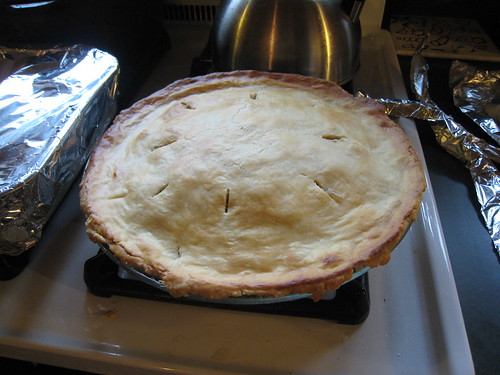
Then Thursday morning, I baked a pie (for the first time) totally from scratch.
It came out pretty good, the crust was nice and flaky and the pie was not too sweet without being tart.

Click here for more pie=making photos.

We had a nice Thanksgiving dinner at Mildred’s, with lots of yummy food.

Friday I went for a walk with Judy, then she patched my coat (I still need to sew the button back on, she didn’t have the right thread), and then we went through some boxes of old childhood records and drawings.

More photos of the walk.

I drove home Friday night, and when I got home, lots of surprises were waiting for me:

1. They finished paving Clark street! It’s no longer an obstacle course.

2. My new Sony eBook Reader arrived! Yes, I am a gadget whore.

3. A document from the court came in the mail – my name change went through! I don’t even have to go in to court!

4. UPS didn’t deliver my projector, I have to go pick it up on Monday. This is because UPS sucks. FedEx is so much better.

Amazon Kindle eBook Reader

Following in Sony’s footsteps, Amazon has just launched their “Kindle” device.

Like the Sony Reader, the Amazon Kindle uses an electronic paper display.

Here’s a comparison of the two:

  Sony Reader Amazon Kindle
Price $299.99 $399.00
Screen 6″ 8-grayscale 600×800 E-ink 6″ 4-grayscale 600×800 E-ink
Storage 256MB? 256MB
Expansion SD card SD card
Native Formats BBeB Book, TXT, RTF, PDF, JPEG, GIF, PNG, BMP, MP3, AAC Kindle (AZW), TXT, Audible, MP3
Weight 9 oz. 10.3 oz.
Size

6.9″ x 4.8″ x 0.3″ 7.5″ x 5.3″ x 0.7″
Inputs 0-9 keys, page next/back, 4-way d-pad keyboard, page next/back, scroll wheel
Wireless none EVDO (free access)
Text Sizes 3 6

At first glance, the Sony Reader looks better, with a $100 cheaper price, a newer version of the E-ink screen, a sleeker design, and support for more file types natively. However, by adding free EVDO wireless and a keyboard, the Amazon Kindle lets you buy books and download content from the reader itself. Plus Amazon may have the weight to get more publishers on-board with the idea of eBooks than Sony can.

Either way, some competition is a good thing, and will hopefully drive the price down and the quality up. $300 and $400 are still too pricey for the average user.

More PRS-505 Details

From Sony’s site:

What are some of the most important changes between the PRS-500 and the PRS505?

  1. The PRS-505 has a new screen that has a faster refresh than the PRS-500’s screen and is also a bit lighter. The new screen also supports 8 shades of gray vs. 4 on the PRS-500.
  2. The User interface is much improved with:
    • Page turn buttons moved the right side of the Reader
    • The Numerical numbers now match up against the screen so when menus are displayed the appropriate button is to the right of the entry.
    • The Menu key is now by itself and clearly marked
    • The Jog stick is gone replace with four way arrow buttons and a center enter button.
  3. Books have become easier to search as there are now tools that sort the books into alphabetical groupings for Titles or Authors.
  4. The PRS-500 had a single storage media slot that could handle both SD or Memory Sticks. These cards could support either 2GB (SD) or 4GB (MS) for a maximum external storage of up to 4GB. The PRS-505 has two slots in parallel that allow for SD and Memory Stick Duo cards. These cards can support up to 2GB (SD) and 8GB (Memory Stick Duo). Because there are two separate slots the total amount of external storage the PRS-505 can support is up to 10GB.
  5. The USB functionality is much improved
    • The PRS-505 supports the USB 2.0 standards which allow for faster transfer of data.
    • The PRS-505 can be charged when the battery is empty from the USB port of almost any PC even if there is no software loaded on it. The PRS-500 needed to be plugged into a PC running pre-installed software before it can charge and even then it could not charge if the internal Reader’s battery was dead.
  6. The Connect Reader software is being replaced with “eBook Library v 2.0” which does look and work much like the older software. The only noticeable difference is that with a PRS-505 the new software can use a new Auto-sync feature. Please note that the PRS-505 cannot work with the older Connect Reader software.

Sony Reader v2 is out

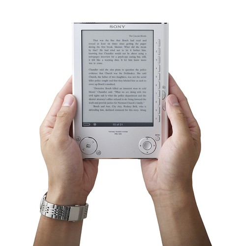
Sony announced an updated version of their eBook Reader (PRS-505)!

Differences from the old one (PRS-500):

  • 8-shade greyscale instead of 4
  • Improved page turn speed
  • Twice as much internal storage (now 128MB)
  • Memory is accessible directly as a mass storage device over USB
  • Improved button layout
  • Now comes in silver or dark blue instead of just dark blue
  • Improved screen contrast
  • Automatic Sync option
  • Lower price (now $300, was $350)

Will I get one? Well, you know me, so probably. I really like the v1 one, and better refresh speed, contrast, and more shades of greyscale would all be good features to have.

you eDiots!

So here we go again – Amazon is getting ready to launch its own eBook reader.

The good: they are Amazon, and it is an eBook reader

The bad: preliminary pictures show a clunky design with a full querty keyboard, and the projected price will be over $400.


Amazon Kindle

What will make a popular eBook reader?

  • LOW price point. Like $50-$100. Perhaps a maximum of $200, but only if it comes with a coupon for $50 worth of free books or something.
  • Simple, easy-to-use design. If you are shooting for wide acceptance, the average joe wants it to look like a book, not a computer. Tons of buttons and complicated design are intimidating to users. The design should have a minimal number of buttons: a page next, page back, and a 4-way d-pad and select button for navigating menus. Or just a page next, page back, and a touchscreen. The design should be symmetrical, with the buttons on the side, so it can be held by righties or lefties, also so you can switch hands if one gets tired, or if you are lying in bed reading on your side and roll over to the other side.
  • Crisp display. It needs to look like a book. eInk, like on the Sony reader, looks good. But they need how to work out how to make that self-illuminating somehow.
  • Long battery life. Books don’t run out of batteries, eBooks should go a long time without recharging. The Sony reader is pretty good in this department.
  • Rugged. The design should be ruggedized, and if possible, be able to survive a drop or two. Especially if you’re going to get students, teens, and kids using it too.
  • Books. An eBook is worthless without content. Like the DVD format getting studios to sign on, an eBook format needs to get publishers to sign on.
  • Workable DRM. I understand why publishers want DRM, to prevent pirating of content, but it’s got to be a workable system. There needs to be a way for people to lend their eBook to a friend, or even sell it in a used eBook store. Another part of this is that there are tons of different devices and formats. There need to be some standards that are universally accepted.
  • Marketing. Most people have no idea what an eBook is, some have heard of it but don’t understand it, and some actively oppose them. Sony Readers sit quietly in Borders on a lonely little kiosk. There needs to be a major promotional push to get peope excited about eBooks.
  • Reasonable book prices. If the hardcover is $20, the eBook should not be $20. I don’t care what bullshit spin or cost justifications publishers put out there, eBooks are cheaper to make. Period. When a book goes to print, it’s in a digital form already. For eBook publishing, it needs to be reformatted to the eBook file format, and put up on a server. That cost has to be way less than printing a book and shipping it all over the world. And as eBooks are published more often, the cost of format conversion should get cheaper, or even nonexistent, if publishing software offers a pushbutton conversion to eBook formats. So if the hardcover book costs $20, the paperback costs $10, the eBook should be $5-$8. It should *always* be cheaper than the cheapest printed version. Amazon has tried selling eBooks in the past, but often prices would be based on the hardcover book, so the hardcover would be $20, the eBook would be $18 or $20, but the paperback would be $10. And when the hardcover and paperback prices fell, often the eBook prices would remain as they started, so it would be more expensive than the hardcover!

Instead, Amazon will probably have none of those things, and surprise, surprise, it will be a flop. And publishers will say “See? eBooks just aren’t a viable platform!”

Sigh.


Sony Reader

Incidentally, the best eBook design I’ve used so far was the Rocket REB 1150, which is still sold by eBookWise.


REB1150

The design is decently rugged, with two big buttons for page next, page previous and a touchscreen. The design is such that you can use it with either hand, and switch hands easily. The innards of the REB 1150 are kind of outdated, though. It uses the all-but defunct SmartMedia memory cards, has an old LCD screen, which isn’t terrible, but isn’t that great, either. The software for interfacing with it is clunky.

My perfect reader:
REB 1150 case, though slimmed down a bit, and lighter. Sony Reader innards. Bam!