Just got my Kindle Touch, I’ll post thoughts about that later, but also got a cover for it, the Lightwedge Verso Prologue Antique Cover – Tan. Here’s what I think of it.

Appearance
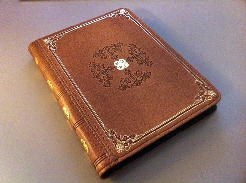
The look of it is great, and what drew me to this over some other covers. It’s designed to look like an antique leather book, and is made with a fabric/rubber material that reasonably replicates the look and feel of leather without any dead animals.
The embossing is great, although the gold paint feels a little cheaply done. I’m fine with the chips in the lines, they feel intentional, giving it a slightly used look, but there were also small spatters of gold on the back and front, as if someone put glitter on it. Probably a result of the production method used, but minus points for attention to detail.
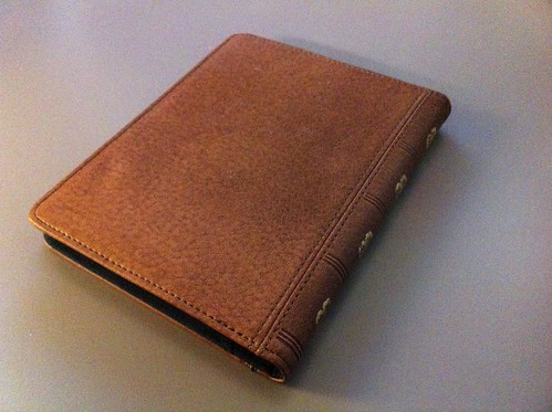
The back is plain, aside from unintentional small flecks of gold paint.

Fit with Kindle Touch
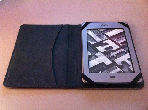
The Kindle Touch is secured in place with 4 elastic straps. It’s a very snug fit and feels very securely held. It’s a fairly common design for covers, and works very well here.
There’s also a pocket, which on Lightwedge’s site they show being used to hold the reader – you fold the cover behind and use the pocket like a mitten. I tried it and it’s a little weird, I don’t think I’ll ever be holding it like that. I suppose it could act as an actual mitten and keep your fingertips warm if it were cold out… but other than that, you could store some papers in there.

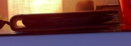
There is one thing about the fit that I don’t like. The case is designed extra wide on the left side. I don’t know if this is to accommodate a larger device (perhaps the nook touch is slightly wider than the kindle touch?) or if the designers just didn’t factor in the hinge area when creating it, but it means the overall case size is about a half-inch wider than it needs to be. This may not seem like much, but a half-inch can make all the difference when trying to stuff something in your coat pocket. It just adds overall to the surface area and bulk for no good reason. The hard back and cover are simply designed too wide.
I took a photo edge-on so you can see the wasted space:

Other Comments
When I first got it, the cover did not close on its own, instead it would stay slightly opened. However, I worked the hinge for a while to try to loosen it up, and it seems to have helped. It also doesn’t lie flat when the front cover is folded behind (the way I read most often), it is more elevated on the hinge side. I think this will also improve with use but probably never lie completely flat.
Summary
Overall it seems like a decent cover, it’s certainly pretty but the fit and function isn’t as good as the Amazon cover I have for my Kindle 3. For $40 it’s not as well-designed as it should be. It’s not clunky enough that I’ll return it, but it’s not as slick as I’d hoped.