nook initial impressions

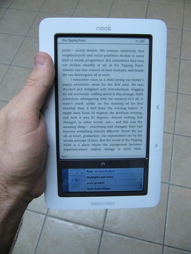
My birthday present to myself arrived yesterday: the new Barnes & Noble “nook” ebook reader.

As you probably know, ebooks and ebook readers have been a hobby of mine for a while now. I’m rather passionate about ebooks. So of course I had to get a nook to see how it stacks up.

nook

Design

The look of the nook is great. The front is smooth slightly glossy plastic, with a matte finish on the buttons on either side of the screen. The back is a slightly rubberized plastic that feels comfortable in my hand. The weight feels good, and it feels sturdy overall (though I wouldn’t want to drop it). The buttons don’t have seams, and have a nice click to them. The buttons are on both the left and right edges, so it’s good for left or right handed use.

The side buttons do have one major flaw in my mind – they are reversed. When I hold the nook, my hand is comfortable gripping it by the side, with my fingers on the back and my thumb resting on the edge. But my thumb rests on the upper button, which is the “previous page” button. To go to the next page, I have to bend my thumb down every time, which is uncomfortable, or hold the nook by the bottom edge, which is also less comfortable. Lying on my side in bed, I found myself holding the nook with one hand and tapping the “next page” button with my other hand, obviously not ideal.

This button issue isn’t a dealbreaker, but it’s such a basic error it makes me wonder what sort of person tested it – after holding it for one minute, my conclusion was that the “next” and “previous” buttons should be switched.

The screens

The e-ink screen looks great, same e-ink technology as in the Sony and Amazon devices. It has a gray tone to it, nowhere near as white as paper, but is very easy to read. No built-in light source, so you’ll need a reading lamp or some sunlight, same as a paper book.

As with other e-ink screens, the screen takes about a half-second to refresh, and does it with a sort of a blink, which some people find offputting. I’ve never had an issue with it, I find e-ink very easy to read from.

The nook’s particular hook is the second screen, a small LCD touchscreen. I found the initial brightness of this screen way too high, especially next to the non-light-emitting e-ink screen, so I turned the LCD way down, to 7% brightness.

This screen is an interesting workaround to the slow refresh rate of the e-ink, and not cluttering up the device with lots of buttons, like the Kindle. In fact, all three major ebook makers have their own solution for interactivity: Sony has a touchscreen surface overlayed on the e-ink screen, which some say makes the screen harder to read; Amazon has a physical keyboard; Barnes&Noble has the small LCD touchscreen.

The LCD looks good, but is somewhat unresponsive. Using it as an on-screen keyboard works fine, but scrolling vertically through the iPod-style menus is clunky. As an iPhone user I am used to the buttery-smooth scrolling of the Apple device, in comparison the nook’s touchscreen is barely working. It seems more like a software issue than a hardware one, so I’m hoping they can make it respond more smoothly with an update at some point. Right now though, it’s very clunky.

The store

The B&N store on the nook is obviously a first attempt. It’s not terribly well-designed, and in a lot of ways seems broken.

First and foremost, navigation is bad. Just going to “ebooks” gives a result something like “Page 1 (items 1-20 of 30,000)”. While I’m sure B&N wants to show off how many books they have available, putting them all in one long list (with no apparent order to it) is absurd, who is going to page through thousands of screens of random books?

Going to a category isn’t much better, I went to “reference” and the books there seemed to be random as well, there were things like “The Adventures of Sherlock Holmes” in there. In fact, most of them seemed to be fiction, not reference. So whoever categorized these (or wrote the category code) did a terrible job.

I think right now browsing the store is pretty unusable, I didn’t try searching for a specific book, but that’d probably be the best bet for locating content.

Overall

The nook is a nice little device. I really like the feel of it and the design, aside from the flaws mentioned above. It seems like most of the issues are software ones, so it remains to be seen how aggressive B&N will be in doing updates. If they step up and work hard, they could rival Amazon. If they sit back, I think they’re going to lose out.

nook

Car Sensors

Why don’t modern cars have more external sensors?

Sure, some minvans have backup sensors so it beeps if you’re about to run over little Timmy, but it seems like sensor technology hasn’t gone anywhere in a long time.

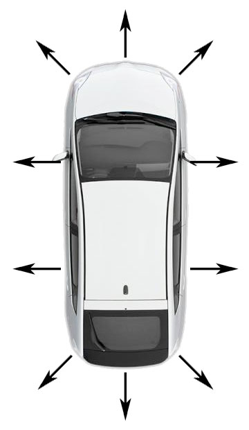
Why not a series of like 8 sensors arranged on the outside of the car, with a range of like 4 feet or so? I’m not sure the best sensor for the job, perhaps a laser tape measure type device, it just needs to return a reasonable directional distance to large objects.

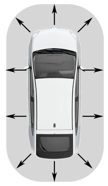
This would give you a rough sensor sweep of the car’s immediate surroundings.

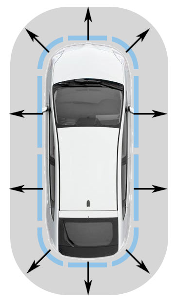
You could sort of visualize it in a force-field style display.

If a car or other object triggered the sensor’s proximity radius, the indicator would change color.

On the dash it would be a simple display, much like the door-open indicator on some cars.

This would not be a replacement for mirrors or anything, you would not rely solely on this indicator, but it would be an added safety mechanism to alert you to pay attention to that area, in case you didn’t know there was a car there.

Another similar idea, but one that might be more distracting, would be a roof-mounted camera system that would provide a composite overhead view of your car and the immediate surroundings, so you could tell at a glance if there were a car in your blind spot.

On World of Warcraft and the Stock Market

Yesterday I sold some Apple stock I had purchased. It worked out well for me, I bought it when the economy was shaky and the stock market in shambles, it cost me $85 a share. Now, a year later, I sold it for $199 a share. So I made some money, not a huge sum, maybe $3K after taxes.

It got me thinking about the nature of money. After all, what had I done here? I had clicked a mouse a few times, waited a year, and clicked a mouse a few more times, resulting in almost doubling my money. It was very little effort, and a very abstracted process.

Now here’s the thing – the amount I made was based on the amount I had initially. If I had millions, I would have made millions. It had nothing to do with skill or work, it was based entirely on what arbitrary amount of money I had to begin with. There is a sort of snowball effect that happens, the more money you have, the easier it is to make more money.

It reminded me of playing World of Warcraft three or so years ago. When you start playing in WoW, you have a low-level character. Tasks you do and enemies you defeat don’t give you a lot of cash, so you earn copper and silver. For a low-level character, getting a gold piece is a big deal. I never played long enough or hard enough to build a high-level character, but built up to something like level 14 and ended up playing the auction house.

The auction house is essentially like an in-game eBay – you can put items you have found up for auction, set a price and an end time and then people can bid on them. I used a plug-in someone had written (legal in the game) which monitored the market, and tracked the going rate for each item. I would then look for items selling below market value, buy them, and sell them for a competitive but profitable price.

Out in the wilderness, my character had to fight monsters and save up meager coins to buy slightly better weapons. At the auction house, a little buying and selling made easily more profit than fighting monsters. And the more money my character had, the easier it was to get more. There was a leveling-up effect to trading – at first I could only afford to buy and sell cheap items, but then finally had enough cash to buy and sell some more expensive items. Eventually I moved from selling things worth silver to things worth gold. Suddenly, the gold that was hard to come by in the wilderness was flowing to my character with relative ease.

I eventually stopped playing WoW, as it was eating up a lot of time. But it had been fun while it lasted. What it had done is made true for me an old adage, “the rich get richer”.

Money these days is such an abstract concept – with direct deposit and debit cards, we often never even see it in physical form. What’s interesting is that there is little difference conceptually between money in WoW and money in the real world. They are both abstract representations on a computer somewhere. The difference is that people have agreed that virtual dollars can be exchanged for goods and services, while virtual WoW gold cannot. Even that’s not entirely true, black markets exist that sell WoW gold for dollars, allowing conversion of one virtual currency into another.

I think this is part of the mentality of the rich, being able to deal with money as an abstract, to treat the system as a game. Personally, I fall somewhere in the middle, not poor but not rich either. I can think of an investment as a game, but at the same time, I have a mortgage to pay every month, and food to buy.

People are always talking about some “get rich quick” scheme, but the sad truth of it is that most of the time, “get rich quick” schemes only work if you are already rich. Even if you can double your money, it doesn’t amount to much if you only had a small amount of money in the first place. Meanwhile, someone who is rich can earn an 8% return on an investment and make more than a pile of poor people do in a year.

It’s a disparity that’s a side effect of the capitalist system as a whole. The thing is, poor that decry this system usually support it at some level, because they see themselves as someday achieving wealth and getting their “piece of the pie”. It is often a complaint of envy, not of justice. They don’t object that the rich exist, they object that they are not rich themselves.

I find the whole thing very interesting, and sad in some ways, but don’t have any solutions to offer. Alternative systems like communism tend to fail for the same reasons, corruption and the rich using influence to get richer.

Anyway, just something I was thinking about the last day or so.

Movies coming out soon that might be good

I Sell the Dead
8/7/2009
Grave robbers discover that selling the undead is very profitable.

How did I not hear of this? It looks Awesome!

District 9
8/14/2009
Aliens land in South Africa and become an oppressed minority.

Based on the short film Alive in Joburg by Neill Blomkamp, which was awesome. Should be good.

Inglourious Basterds
8/21/2009
An elite team is dropped into Germany to kill as many Nazis as possible.

Quentin Tarantino does WWII, so expect lots of swearing and blood and violence, and probably a good time. Also, yeah, it’s misspelled – on purpose, apparently.

World’s Greatest Dad
8/21/2009
A poetry teacher cannot relate to his son.

Actually looks pretty good, a dark comedy written and directed by Bobcat Goldthwait.

9
9/9/09
Post-apocalyptic world where living toys try to fulfill a mission.

Looks awesome, I am so there!

The Invention of Lying
9/25/2009
In a world of only truth, one loser discovers the secret of lying.

Looks Ricky Gervais-y… kinda like Ghost Town, pretty good but not amazing. But worth a watch.

A Serious Man
10/2/2009
A man is overwhelmed by daily life.

Looks good, Cohen Bros doin’ their thang.

Whip It
10/9/2009
A quiet, shy girl finds an outlet in roller derby.

Dunno about this one, but it stars Ellen Page and is directed by Drew Barrymore, so there’s two reasons I wanna check it out.

Where the Wild Things Are
10/16/2009
A movie adaptation of the Maurice Sendak classic.

Looks great!

The Box
10/30/2009
Based on a Twilight Zone episode, a couple is given a box with a button in it, and told if they push the button, someone they have never met will die, and they will be given a million dollars.

I dunno… was a cool Twilight Zone episode, but dunno if this looks as well written. Might be good, though.

The Tools I Use

If anyone’s curious, here’s a look at the development tools I use, day-to-day.

I use a Mac, so these are Mac-based, but many are also available for Windows.

MAMP

Free all-in-one webserver package, instantly sets up Apache, MySQL and PHP. Great for developing locally without all the hassle of trying to build a server yourself.

Zend Studio (plugin for Eclipse)

Eclipse, in my opinion, is slow, bloated, and lacking in some basic features like soft text wrap. Why use it as my primary IDE, then? PHP debugging. Zend Studio (which used to be a nice stand-alone IDE, but is now just a plugin for Eclipse) has a set of tools for runtime PHP debugging which in my opinion are essential to PHP devlopment.

TextMate

Although I work on big projects in Zend Studio, when I just want to try something out, I’ll often fire up TextMate. It’s small, quick, and pretty full-featured. Some people I work with prefer BBEdit, which I’ll admit has more features than TextMate, but TextMate feels cleaner and… I dunno, more *modern* to me.

Photoshop

For graphics and occasional mockups.

Navicat

For working with MySQL, I love, love, love Navicat! If you are currently using PHPMyAdmin, ditch it and switch to Navicat. You won’t regret it. I’ve heard a couple people complain that Navicat’s icons look too “Windows-y” – good god people, get over it. They look fine, and it’s certainly a lot better-looking that PHPMyAdmin. If you’re not sure, Navicat Lite is free and does most of what the full version does, try it out!

Omnigraffle

Good for whipping up quick page wireframes and site flow diagrams for requirements documentation. Believe me, that doesn’t sound like much, but it’s important and the clients love the clean diagrams produced with it.

StarTeam

If I had my druthers, we’d probably be using SVN or something more industry-standard, but it’s what we use at work, and someone else maintains the server so I don’t have to, which is reason enough to use it. I have no desire to become a sysadmin. Like Eclipse, the StarTeam client is also Java-based, meaning it’s slow and bloated. Plus Borland dropped Mac support, so it takes some hacking to get it working on the Mac, though once it’s set up it works fine. There might be better packages out there, but StarTeam gets the job done, and that’s all I need out of a source control system.

Parallels with Windows XP
IE Collection

For IE testing. IE Collection is great, lets me run IE6, IE7 & IE8 side-by-side.

Firefox

Although I test in multiple browsers, Firefox has great plugins available that make it my favorite browser for web development. I tried Webkit for a while, but the better plugins for Firefox brought me back.

Firefox plugins:

– Download Statusbar

Better display of download status than the standard window on Firefox.

– Firebug

A super-useful suite of web development tools. Essential!

– Screengrab

Take a screenshot of the entire page, regardless of scrollbars, automatically.

– Web Developer

A handy collection of tools for web development. Essential!

– Zend Studio Toolbar

Hooks into Zend Studio, allowing PHP debugging with the click of a button.

There are other apps I use now and then, but these are the primary ones that I use every day.

Edison vs. Tesla

“If I find 10,000 ways something won’t work, I haven’t failed. I am not discouraged, because every wrong attempt discarded is another step forward.”
Thomas A. Edison, Encyclopaedia Britannica

“Genius is one per cent inspiration, ninety-nine per cent perspiration.”
Thomas A. Edison, Harper’s Monthly, 1932

“If Edison had a needle to find in a haystack, he would proceed at once with the diligence of the bee to examine straw after straw until he found the object of his search… I was a sorry witness of such doings, knowing that a little theory and calculation would have saved him ninety per cent of his labor.”
Nikola Tesla, New York Times, October 19, 1931

Hastings Cakes video

I shot my first real video with the new camcorder this morning. I did a mini cooking show on how to make Hastings Cakes.

I shot it and edited it this morning before heading out to work, just before leaving I started it uploading.

It came out kind of long, 6 mins 16 seconds, I can probably get it down to 4 minutes by cutting out the washing and waiting to cook parts. But I think it came out OK for a first try.

Hastings Cakes Recipe from Tev Kaber on Vimeo.

Memory Test

I was riding home yesterday, Carl was driving, and we were listening to that iTunes Weekly Rewind podcast, which is just a few people talking about music and playing a variety of clips.

There were a few that sounded interesting, and I wanted to remember what they were.
My first instinct was to reach for my iPhone and write myself a note, however, I decided it would make a good experiment.

So there were 3 phrases that I wanted to remember, either band, album, or song names. The phrase would be enough to find out more with a Google search later.

The first phrase I converted into a visual mnemonic.
The second phrase I converted into a mixture of visual mnemonic and text.
The third phrase I left as text.

I forgot to try to remember them when I got home (metaforgetting?).

So today I remembered the experiment, and was trying to remember the three phrases.

The first was easy to remember. I visualized a clothing iron and a glass of wine. This is for a band called “Iron & Wine”.

For the next phrase, I could remember the visual part of the mnemonic, but not the words. I had been visualizing one word, with a line drawn under it, and another word underneath. But I don’t remember the words. It was something like “____ under ____” or “_____ below ____” the second blank mighta been a longish word.

The third phrase I didn’t remember at all.

Clearly, visuals are extremely easy to remember when compared to words.

When a new programmer was hired to our team at work, I came up with a visual mnemonic for his name, and can now recall it easily. I pictured a guy with lots of keyboards and a camera, “John Tesh” and a “Konica”. His name, therefore, is Shantesh Kanekar.

Reminds me of an example Derren Brown gave for how he does a card trick. He said he visualized a room, and in that room are 52 objects, each representing a specific card. When a card had been played, he would visualize putting a bright ribbon tag on that object. In this way, he would be able to remember which cards had been played, and which were still in the deck.

I guess to remember the missing two items from that podcast, I’ll have to download it and listen to it again. I checked for show notes, knowing my memory would be jogged if I saw the missing phrases, but oddly they list the songs for every episode except that one.

jQuery

Started using jQuery yesterday, just starting to get into it, but so far I’m liking it. It’s a Javascript library that has a bunch of predefined functions and structures set up to make it quicker to write stuff. There’s also a UI component to make it easy to do stuff like dialog boxes and such.

Nice to be able to write something quickly and have it work in all browsers.

Here’s my first test, a simple box with a slide animation between 4 boxes of content when you click buttons.

For some reason it has a slight tearing happening during the animation in FireFox on Windows, but looks good on every other browser (even FireFox on Mac). It only does that for the 1/5 of a second during the transition animation, so I guess I can live with it.

I could do the same thing without the animation pretty easily with basic Javascript, but jQuery’s animation makes it look that much slicker. I’m also starting to do some drag and drop tests with jQuery UI which I may use in a project at work.