Hyundai’s 360 Car Cam

A while back (Oct 27, 2009), I wondered why cars didn’t have better sensors and cameras.

I made a sketch of how a 360-degree proximity sensor dash display might look:

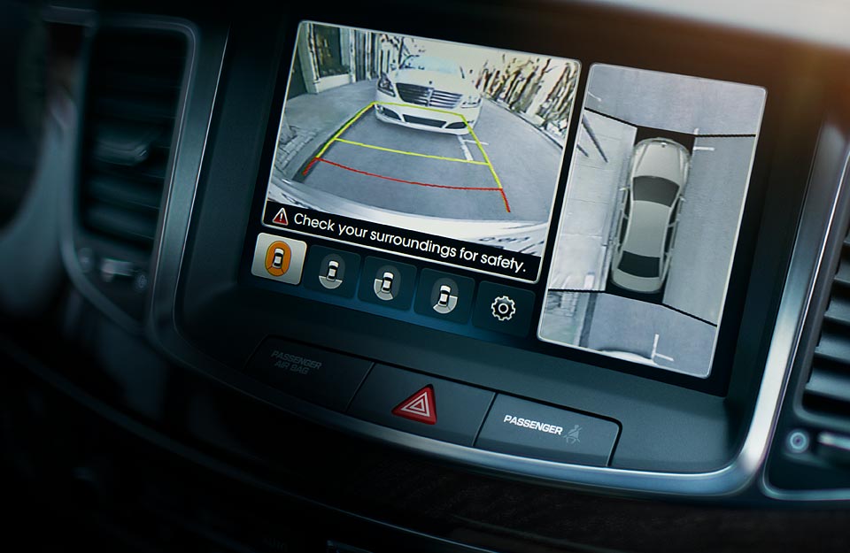
I was watching TV last night, and a Hyundai ad came on showing pretty much what I was imagining.

Here’s how theirs looks – it’s more of the “distracting” video version I mentioned than the compact glance version, but points to Hyundai for making it!   Looks like they stitch together video from 4 cameras to get a full surround picture.

2014 Hyundai Equus dash


D&D Arena of War – mini review


dd-aow

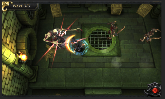
Tried out “D&D Arena of War” on iPad… It’s kind of a mess of a game.

At the core is an arena match very similar to Squids, which if you haven’t played it, has a mechanic which plays like a cross between angry birds and billiards. You pull back and release your character, they run over and attack the enemy character you aim them at. Additional damage can be done by hitting an enemy into a wall or a bomb (bombs are scattered on the playfield).

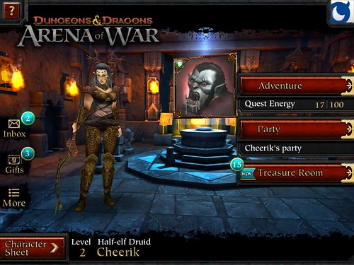
Ok, that’s all fine… weird match for the D&D license, but whatever. On iPad with retina display, graphics are an odd mix of high-res and low-res, with the main gameplay and powerup cards in high-res and the rest of the interface in crummy-looking low-res. Not terrible, but not polished. It lacks polish overall, some things don’t have sound effects, like “Fusion” to combine powerup cards plays a choppy animation of the cards spinning around, but no sounds other than the continuous background music. The tutorial shows you the basics but leaves most things a mystery.

Which brings up the main problem, it’s a confusing mess of things. You have potions (needed to retry missions), treasures (used to get cards), cards (equipped to use as special abilities in battle), fusion (combining cards to make them better in some abstract way), bingo (kind of like a checklist of micro-achievements to get some reward, I think), gold (to buy more stuff, and of course you buy gold with real money) and an inbox (messages to tell you to buy things, that don’t seem to want to mark as read). Actually, when I list it out like that, it sounds a lot less confusing then they manage to make it in the interface.

Overall as a game it’s kinda meh, kind of fun in a mindless way, but as an interface it somehow taking a simple concept and ends up making it as confusing as possible.

I’d say play Squids instead, it’s prettier, has more character, and has essentially the same gameplay but with bigger maps with more of a mix of combat and exploration.

5 Second Films

I watched far too many 5-second films last night… but my loss is your gain!  I figure for every 10 bad ones, there is one good one.  But they are so prolific that it works out in the end.  Here are some keepers:


Ouya Review

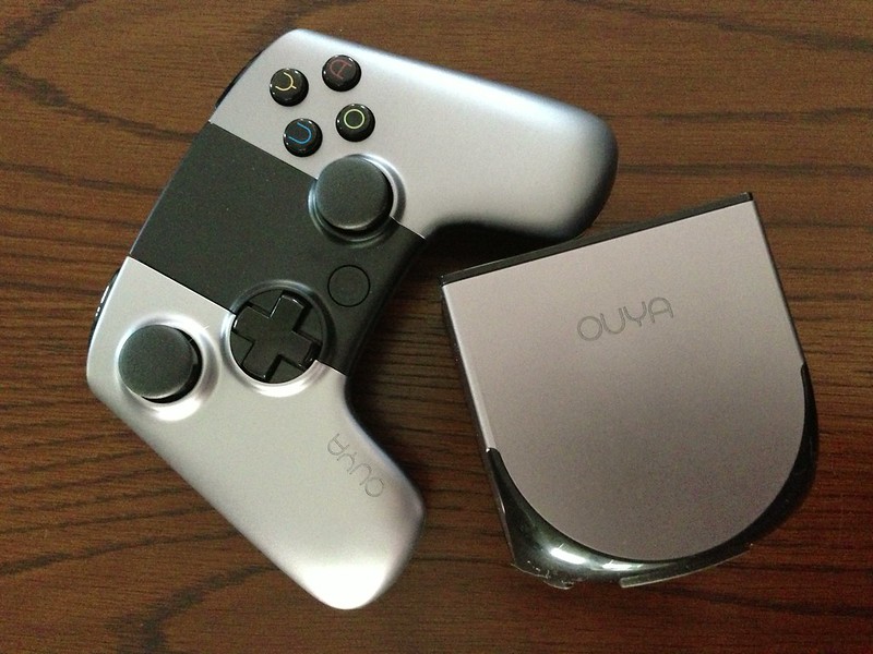
Ouya and controller

If you haven’t heard of Ouya, they had a wildly successful Kickstarter campaign to make an Android-based open gaming platform.  The idea was to be inexpensive and developer-friendly.  The console itself was designed as basically an android phone with no screen, so it would be easy for developers of Android games to port games to Ouya.

I backed the Kickstarter, and just got my Ouya this week.  It doesn’t launch officially for another month or so.

So, how is it?  Well, it’s kind of mixed.  Some of which may improve before the public launch, some of which may not.

The Console

The Ouya console itself is nicely minimal.  Just a small box with some ports on the back and a button on the top.  There are also the names of the top Kickstarter supporters etched into the side, at the top of that list is a familiar name – Notch, creator of Minecraft.

Ouya Console

Setup is simple, just attach it to your TV with an HDMI cable, and plug the power in.  Ethernet is optional, it has WiFi, though I opted to use ethernet.  USB port is also optional, for external storage and other USB stuff.

The small size of the box does mean it will be at the mercy of the cables plugged into it, if they aren’t completely slack they could tip the Ouya on its side.

The Controller

The controller looks nice, so much so that I ordered an extra one to use for a second player or to use as a controller for my laptop.  However, looks are not everything.

The controller is pretty big, somewhere between the Xbox 360 and Original Xbox controllers.  It feels decent enough, and holding it my trigger fingers naturally rest on the L2 and R2 buttons, as with the Xbox 360.

Controller comparison: PS3, Ouya, Xbox 360

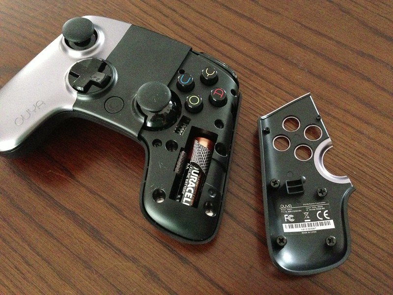
The problem is not the size, though it could probably stand to be a little smaller.  The main issue with the controller are the battery placement and the responsiveness.  It takes 2 AA batteries, which are inside the handle parts of the controller.  To get to them, the silver front plates on the controller lift off, allowing access to the batteries.  It’s not a difficult process, although it’s not totally smooth, getting the plates off may take a little prying with fingernails.  The faceplates are held on with magnets, which seems like a good idea, but seems to cause problems.  The plates don’t sit completely snug, which doesn’t seem like a problem at first, but when I was playing a game and hitting the O button, it suddenly got caught under the faceplate, causing my character to die a horrible digital death.

Removable faceplates

The other issue with the controller is lag.  I was playing Pinball Arcade (which I have for iPad, so seemed like a good comparison) and the flippers would flip well after I pressed the trigger.  It could be an issue with that particular game, it doesn’t allow you to remap the controls, so I was stuck using the L2 and R2 buttons, which are analog triggers, so perhaps they weren’t calibrated correctly in the game code.  Whatever the reason, it made the game basically unplayable.

Luckily, the Ouya and PS3 both use bluetooth, so I paired a PS3 controller to the Ouya and gave it a try.  Suddenly Pinball Arcade was playable!  I played a few games with the PS3 controller and it seems to make the Ouya experience much better.  However, some games didn’t recognize the PS3 controller’s input and would only work with the Ouya controller, so it’s unfortunately not a cure-all, which is really too bad, the PS3 controller was better in pretty much every way otherwise.  The Ouya controller does have a touchpad-like surface in the upper part (probably part of why it’s so large) which can act as a mouse if you need that for something.

The Menu

The menu system on the Ouya isn’t bad, but it still feels beta-y.  It is sometimes unresponsive, and game thumbnails can sometimes take forever to load, and don’t seem to cache very well, so frequently I find myself browsing lists of games that are just titles since the images haven’t loaded.  Also navigating the menu is sometimes laggy, sometimes moving a direction seems to “stick” and move several times instead of once.  This seemed to happen less when using a PS3 controller, so maybe it’s partially a symptom of the controller.

The menu didn’t seem terribly well organized grouping games into large categories several of which were “featured”-type categories. The broad groupings works ok for now but I can see it getting cumbersome once more games are available.

The Games

This is the important part, right?  It’s still a bit slim and disorganized, and heavy on “indie” type games, which is fine but they often don’t show off the system very well, with simplistic graphics.  There’s also an interesting business model – all games are required to be free, and can optionally have an “unlock” option for money.  This results in many games with different approaches to paying – some let you play the first X levels for free, some have a timer that let you play the first X minutes for free, some have purchasable blocks of time rather than a straight unlock price, some have constant banners and messages perstering you to buy.  I can see what they were going for, but I’d rather have a more consistant model or just pay outright and avoid the pestering.

I haven’t played that many games yet, but did find a fun little one called Bomb Squad.  Picture Bomberman, but without the maze, everyone just running around an arena lobbing bombs at each other, and different types of bombs if you get powerup crates.  Simple, but fun.  Also the aforementioned Pinball Arcade, which does have control issues with the Ouya controller and even some when using a PS3 controller (the “pull back plunger and release” part is wonky and bad) but gameplay-wise is good pinball fun. There are quite a few games slated to come out on Ouya, so the library should flesh out soon enough.  Don’t expect AAA titles, but there should be a good supply of smaller titles coming.

Emulation

One of the main things I was hopeful about with the Ouya was the potential for it as a retro game emulation box.  Sadly, not a lot has been ported yet, but I did find one good one: SuperGSNES is a well-done SNES emulator that played the few games I tried on it.  Rock N Roll Racing had a few graphical glitches on the menu screens, but was otherwise completely playable.  Chrono Trigger and Megaman X seemed totally fine.  There are more emulators on the way, I plan on trying them all. =)

To Sum Up

I wouldn’t call the Ouya a failure, but I wouldn’t call it a complete success, either.  Many of the issues could be fixed with software updates prior to the full launch, or even a little bit after, but some of the issues with the controller seemed like hardware issues that are unlikely to be fixed by launch.  And a flaky controller is a hell of an Achilles heel for a console to have.  It’s too bad some games didn’t work with a PS3 controller, otherwise you could just use a PS3 controller and never use the Ouya one.  I suppose it’s still possible for Ouya to do another revision on the controller to fix these issues, but hardware can be an expensive thing to do design revisions on when they’d already considered it “done”.

Would I recommend it?  Hmm, hard to say.  Right now I’d say “wait and see”, and if the controller issues get resolved, it could be a nice fun little system. At only $100 it’s cheaper than pretty much anything else out there.


The Science Debate

Scientific American invited both Obama and Romney to answer a set of questions on the topic of science.

After looking at the article with each candidate’s responses, I thought it would be interesting to parse it for actual content.

It does show a clear difference in many policies, mainly Obama is in favor of regulations and federal programs, Romney would prefer to remove regulations and move towards privatization.

Here’s my summary/paraphrasing of what they had to say, trying to remove as much fluff and windbaggery as possible.

1. What policies will best ensure that America remains a world leader in innovation?

Obama: Double funding for key research agencies, prepare [hire? train?] 100,000 math and science teachers in the next 10 years.

Romney: lower corporate taxes, reform job retraining programs, reduce regulation, enforce IP laws.

2. What is your policy on global climate change?

Obama: It is a big problem. Invest in clean energy, limit emissions, reduce dependence on oil.

Romney: There remains a lack of scientific consensus on severity.  Fund research of lower emission technologies.  Reduce regulations on emissions.

3. What priority would you give to investment in research in your upcoming budgets?

Obama: My Recovery Act invests heavily in research.  Make the R&D tax cuts permanent.

Romney: Direct more federal funding at the private sector. Streamline FDA approval. Remove excise tax on medical device companies.

4. How should we protect against global pandemics and/or deliberate biological attacks?

Obama: Strengthen our systems of public health. Work with the private sector to assess potential vulnerabilities.  Work with our international partners.

Romney: Invest in public health monitoring systems. Fund pathogen research to make countermeasures. Reduce taxes and regulation.

5. Why has America fallen behind in math and science education, what can be done to fix it?

Obama: Prepare 100,000 math and science teachers in the next 10 years, through national STEM (Science, Technology, Engineering & Math) Master Teacher Corps.

Romney: More spending hasn’t produced results and teacher’s unions are damaging to education.  The solution is education reform: charter schools, standardized testing, allow funding for a student to follow them school to school [vouchers?], privatization of student loans.

6. What policies would you support to meet the demand for energy while ensuring an economically and environmentally sustainable future?

Obama: Invest in clean energy such as wind, solar, clean coal, and natural gas. Adopt the Clean Energy Standard to move to 80% clean energy by 2035.  Safe, responsible development of natural gas.

Romney: Allow states to drill for oil including federal land. Allow more offshore drilling. Partner with Canada and Mexico to set up pipelines. Fund new oil surveys. Transparent and fair permits and regulations. Private-sector led development of new energy technology.

7. What steps would you take to ensure the health, safety and productivity of America’s food supply?

Obama: More FDA funding. Promote organic food. Limit livestock antibiotics.

Romney: Move to a more collaborative model where FDA works with industry to establish testing procedures.

8. What steps, if any, should the federal government take to secure clean, abundant fresh water for all Americans?

Obama: My national clean water framework to improve water quality. Fund water conservation programs.

Romney: Reform regulations and laws to be more collaborative with industry. Incentives, market-based programs, cooperative conservation.

9. What role, if any, should the federal government play in managing the Internet?

Obama: Protect IP, strengthen cyber-security, without reducing freedom of expression.

Romney: Government should not manage the Internet. Remove FCC Net Neutrality and other regulations.

10. What role should the federal government play to protect the environmental health and economic vitality of the oceans?

Obama: My National Ocean Policy, fund Gulf Coast, Great Lakes, and Everglades restoration.

Romney: Fund scientific studies, collaborate with fisheries to reform regulations.

11. How will you ensure that policy is fully informed by the best available scientific and technical information?

Obama: Increase transparency, focus on facts not ideology.

Romney: Increase transparency, avoid manipulation of science for political gain. Establish regulatory cap so that agencies spend as much time removing or refining regulations as they spend adding new ones.

12. What should America’s space exploration and utilization goals be in the 21st century and what steps should the government take to help achieve them?

Obama: Send humans to an asteroid by 2025 and to Mars in the 2030s. Operate the Space Station until at least 2020. Fund NASA.

Romney: Refocus NASA, not by adding funding but by setting clear goals. Partner internationally. Develop robust national space security program with space weaponry to protect our space capabilities.  Ease trade restrictions on exporting US space technology.

13. Supply shortages of natural resources affect economic growth, quality of life, and national security; for example China currently produces 97% of rare earth elements needed for advanced electronics. What steps should the federal government take to ensure the quality and availability of critical natural resources?

Obama: Develop alternatives to rare materials. Restrict China’s export of rare materials. Promote US-based recycling to reclaim rare materials.

Romney: Deregulation. Energy independence through more drilling and faster processing of permits.

14. What actions would you support to enforce vaccinations in the interest of public health, and in what circumstances should exemptions be allowed?

Obama: Affordable Care Act makes routine immunizations available for no co-pay or deductible.

Romney: More vaccine manufacturing. More Americans should take steps to get vaccinations. Decrease taxes and regulations to drive medical innovation.


“The Sacrifice” – my dream last night

I am at a convenience store. The clerk, a woman in her 30s or 40s, is looking at a bunch of numbers and doing math over and over. It seems the register is broken and she’s not good at math.

There is an asian couple there with their two young children, a boy and a girl around 5, who are running around the store, up and down the aisles, examining everything. I smile and wait by the counter with whatever it was I was buying. Occasionally I glance at the kids. I chat with the asian man and his wife as the clerk continues to fail at math.

Suddenly it seems quiet. I look around. The little girl is crouched, holding a coloring book and flipping through, staring intently with naked desire to scribble shining on her face. The boy is nowhere to be seen. “Where is your son?” I ask. The couple looks up with alarm.

The man looks around, and goes to the glass front door and looks out. “Oh,” he says, evenly and without emotion, “my son has been stuck by a truck and killed.” I rush over next to him and look out the door. The pavement outside is smeared with blood and hair, nothing recognizable, like highway roadkill.

“Wait,” I say, after a couple long heartbeats, “it’s ok, that’s not your son.” I point at a couple clumps of fur and a paw of some sort. “That’s an animal,” I say.

“I know,” he replies. “That’s our dog, we left him tied outside. My son must have gone out and untied him.”

“Can you see your son?” I ask. With a gut-wrenching matter-of-fact-ness, he quietly breathes “yes.”

This word crushes me, filling me with horror and dispair that almost sends me reeling. He gestures to the other side of the road, where next to some dumpsters is the mangled, perfectly still body of the small child. The man spoke quietly, so the wife, still standing at the counter, didn’t hear his last “yes”. She looks at me imploringly. I feel lightheaded and sick. I stumble back to the counter, and unable to speak, simply shake my head. The woman wails without making a sound, closing her eyes and turning away. And then I start crying.

The clerk, oblivious to all this, and still looking at her sums, says “ok, I think I’ve about got your tab figured out.”

I gape at her. “A kid has just died,” I sputter, “now is not the time for the bill.”

“Wait,” says the mother, walking up to the clerk, “what is the total, I want to go waterskiing later.”

Her face is now composed, probably in shock, I think. I wonder if she really did have plans to go waterskiing, or if her shock is making her ramble, or if she is having a stroke. After a little more cumbersome math, the clerk makes change for the mother. She takes the girl’s hand and leads her away, the girl’s eyes wandering back to the coloring book as they go outside.

“Would you like to come for a walk with us?” asks the man. I nod and follow him outside. I follow them through some alleys and into a large vacant lot, almost a field. They are setting up a picnic.

“What about your son?” I ask, not understanding their nonchalance.

“He was with us, and now he is gone,” he says, “it was sad, but we have moved on.” The family seems calm, cheerful even, in the sunlight and grass. I halfheartedly wave goodbye and wander away, confused. My heart still hurts and there is a lump in my throat.

——–

In the dream, I wake up. I am at some place of Neil’s. Moses is visiting. It is late, and dark. I get up quietly and find a flashlight and set it to “dim”, but my movement wakes Moses and he follows me when I leave the room.

I go into the living room, looking for a notebook in which to write down my dream. I flip through a large sketchbook, there are a number of watercolors and drawings make with ink and water. Most were drawn by me, but Moses had borrowed the sketchbook, so some were by him. I flip through a couple sketchbooks, but they are full.

I find a small notebook, but it’s in a handwriting that isn’t mine. I flip through it and see a mini photo album towards the front. I realize it must belong to Debbie, she must have left it last time she came to visit. Next to that is a checkbook. I open it and try to make sense of the top check, until I realize it’s not a stack of checks, but a single check made out of cloth, a placeholder that came with the checkbook cover when someone (debbie again?) bought it.

I find a small moleskin book, the pages made smaller from ornate borders on each page, but it is blank. “Writing down your dream, huh?” says Moses, “you should call it ‘The Sacrifice’.” I consider for a moment, “well, I’m not sure if it’s the best fit, but I’ll call it that.”

——–
There was another section of the dream, unrelated, where I was in a tech tradeshow, I had a booth of some sort next to a music booth.

Various famous musicians would come to the music booth and play. I started getting some of their autographs on sticker paper, like name badges. One famous musician died after playing, and his clarinet broke into three pieces, not along the seams but cracked apart. The music booth added it to the things they were selling.

At another booth was a physical version of a game a famous game designer was working on. He did race games that looked like Little Big Planet, sort of layered and hand-painted. But right now it was only a hill and a ramp, which I ran along. It ended in a path of blank plywood. There was some question of when he would finish it, he had recently been diagnosed with cancer so it had thrown off the production schedule.

Another booth had some unique programming language, which I sat down to learn. The book to learn it started off with a metaphor involving a piano keyboard, though it was not music-related. You had to draw the first few keys on a piano keyboard, and put the various keywords on the keys to help you remember them. I had trouble drawing the keyboard though, it kept coming out wrong and each time I redrew it, it was more detailed and realistic, though it was supposed to be just a few lines.

This was all tied into talking to Moses in the living room, I think… we were discussing the release date for the racing game, he thought it wouldn’t be for a couple years, but I thought it might be as soon as next year.

There was another part too, where someone, Judy perhaps, was buying a cellphone, but they were all large old flip-phones, and there was a functional display model as large as a person that they were trying to sell to her.

And in the living room, I think Moses and I made too much noise, and Sarah sat up in her bed, which was in the living room for some reason. I told her to go back to bed, but she said something about being up was the thing to do now, so she couldn’t go back to sleep.

——–

When I woke up for real, and rather than root around on my desk for a moleskin notebook and pen I knew were there, I quietly came downstairs and typed this on my laptop, so as not to wake Sarah.

Legend of Grimrock makes the old new again

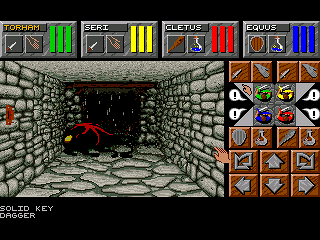
Back on the Amiga days, one series I spent a lot of time with is Dungeon Master.  I played a ton of Dungeon Master I and II, more of the second one.

Dungeon Master is a tile-based dungeon crawler, where you move a space at a time, and can rotate in 90-degree chunks.  Combat was realtime, with enemies moving around and attacking even if you just stood still.

You control a party of 4 characters, you could choose from a selection to build your party.  Combat is based on the items in each character’s hands, if they are holding a sword you can swing it, etc.

Magic is a system of combining runes, you could find new spells through trial-and-error or find scrolls showing the sequence.  There was a certain logic to the combination of runes, for example, the fire rune + the wings rune would make a fireball.

The game boils down to exploring the dungeon, fighting creatures, and solving puzzles to get past locked doors.

Dungeon Master II came out in 1993, the year I graduated high school.  Fast forward 19 years (really?  ouch.) and enter The Legend of Grimrock by indie studio Almost Human.

Legend of Grimrock IS Dungeon Master, with updated graphics and sound.  The controls, inventory, and magic system are instantly recognizable to people who played Dungeon Master.  This is not a bad thing, this is an homage in its purest form, instead of derivative.  Grimrock is lovingly hand-crafted, with gorgeous graphics and atmospheric sound.  It’s clear these guys loved Dungeon Master, and wanted to bring that experience to a new generation of gamers, as well as a treat for those who played the original.

The plot of Grimrock is pretty basic, your party of 4 are criminals of some sort, exiled by the king to die in the depths of Mount Grimrock.  They dump you in a pit at the top of the mountain, and you have to make your way to the bottom to escape.  I’m only a couple hours in, but it’s looking like there will be a twist or two along the way.

The graphics are crisp, with special attention payed to lighting.  Most of the time it’s lit with torchlight, which flickers in a realistic and pleasing way.  Dungeon Master was 2D, Grimrock has made the jump to 3D but kept the style faithful to the original.

The audio is great too, with moody atmospheric sounds and sounds of monsters moving around gives you a good idea where they are, which helps you get ready for combat or find hidden areas.

Overall it’s great fun, and I look forward to playing it some more.

So far my only complaint is that I have to run Windows to play it, a Mac version would be cool.


Questionable Minds Think Alike

From an AIM chat with Adam, talking about the song “Burn it Down” by AWOLNATION:

Adam: this song is stuck in my head http://www.youtube.com/watch?v=rjT8YpNUxY4&noredirect=1
Tev: i listen to that while committing arson
Adam: I can’t see that
Adam: doesn’t really fit that action
Adam:  I do it when making muffins

[then the following were typed almost simultaneously]
Adam: and petting kitties
Tev: when petting kittens

Adam: hahaha
Tev: get out of my head
Adam: I won that one

Review: Lightwedge Verso cover for Kindle Touch

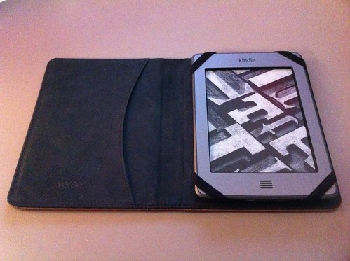
Just got my Kindle Touch, I’ll post thoughts about that later, but also got a cover for it, the Lightwedge Verso Prologue Antique Cover – Tan.  Here’s what I think of it.

front cover

Appearance

The look of it is great, and what drew me to this over some other covers.  It’s designed to look like an antique leather book, and is made with a fabric/rubber material that reasonably replicates the look and feel of leather without any dead animals.

The embossing is great, although the gold paint feels a little cheaply done.  I’m fine with the chips in the lines, they feel intentional, giving it a slightly used look, but there were also small spatters of gold on the back and front, as if someone put glitter on it.  Probably a result of the production method used, but minus points for attention to detail.

The back is plain, aside from unintentional small flecks of gold paint.

back cover

Fit with Kindle Touch

The Kindle Touch is secured in place with 4 elastic straps.  It’s a very snug fit and feels very securely held.  It’s a fairly common design for covers, and works very well here.

There’s also a pocket, which on Lightwedge’s site they show being used to hold the reader – you fold the cover behind and use the pocket like a mitten.  I tried it and it’s a little weird, I don’t think I’ll ever be holding it like that.  I suppose it could act as an actual mitten and keep your fingertips warm if it were cold out… but other than that, you could store some papers in there.

inside cover

There is one thing about the fit that I don’t like.  The case is designed extra wide on the left side.  I don’t know if this is to accommodate a larger device (perhaps the nook touch is slightly wider than the kindle touch?) or if the designers just didn’t factor in the hinge area when creating it, but it means the overall case size is about a half-inch wider than it needs to be.  This may not seem like much, but a half-inch can make all the difference when trying to stuff something in your coat pocket.  It just adds overall to the surface area and bulk for no good reason. The hard back and cover are simply designed too wide.

I took a photo edge-on so you can see the wasted space:

wasted space

Other Comments

When I first got it, the cover did not close on its own, instead it would stay slightly opened.  However, I worked the hinge for a while to try to loosen it up, and it seems to have helped.  It also doesn’t lie flat when the front cover is folded behind (the way I read most often), it is more elevated on the hinge side.  I think this will also improve with use but probably never lie completely flat.

Summary

Overall it seems like a decent cover, it’s certainly pretty but the fit and function isn’t as good as the Amazon cover I have for my Kindle 3.  For $40 it’s not as well-designed as it should be.  It’s not clunky enough that I’ll return it, but it’s not as slick as I’d hoped.

To-Do Apps on iPhone

Trying to get organized?  Me too.

I’ve tried out a number of To-do apps on the iPhone, here are 4 that for me stood out from the rest.


Do it Tomorrow

Do it Tomorrow is a nice, simple, free app.  There are only two screens, Today and Tomorrow, which lets you focus on the tasks immediately at hand.  There is an arrow to shift a task between the two days.

The interface is nice, with a handwritten Moleskine look.


Today

Today is similar to Do it Tomorrow, but with more features.  In addition to today and tomorrow, you also get “yesterday” and “someday”.  “Someday” is handy for jotting down project ideas without specific deadlines.

Tasks also get more detail, you can set a category, priority level, and a due date beyond just today and tomorrow.  Overall it’s a very clean interface, although a bit too clean at first – many of the functions are hidden, so read the instructions before diving in.

This one is my current favorite.


Todo

Todo is a feature-rich all-in-one project organizer app.  It has different types of tasks, such as “call” with Address Book integration, or “Project” with sub-tasks.  It’s powerful but with an easy-to-use interface.  I kind of fell out of using it though, because for me, it almost had too many features.


Epic Win

Epic Win is a more light-hearted approach to a to-do list.  In Epic Win, you create a character, and by categorizing tasks based on stats, you improve your character’s stats and level up.  You also reach checkpoints where you get an item – an amusingly described trinket.  There is no game beyond leveling your character and collecting items, though.  There are coins you also collect, but currently they don’t do anything in the app.

It’s a cool concept, and well executed, but I got tired of it after a while.


So there you have it, 4 excellent apps for keeping on track. Right now I’m using Today, but they all offer a different angle on a simple concept. As long as you use it regularly, any one of them will serve you well.