My OLPC arrived in the mail!
I’d been looking forward to checking it out, and I have to say, it’s a mixed bag. A few positives, a few negatives.
First off, the hardware;
The case is nice. Adam declared it “fugly” when he saw it, but I think it’s fine for a kid’s computer, even pretty in a sort of Fisher-Price way. It looks like it evolved from a Speak-and-Spell. It has a rugged look, though I don’t know how it would stand up to a drop.

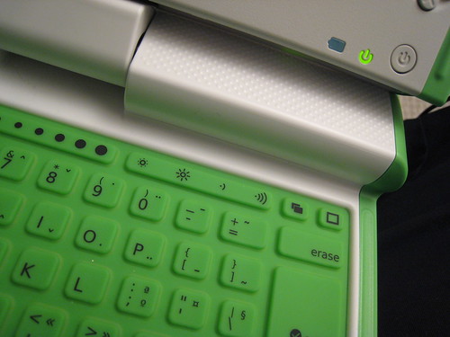
There are two little antenna “ears” that serve as a latch when the laptop is closed, as wifi antenna when they are up, and port covers when they are closed.
There are 3 USB ports, a headphone jack, a mic jack, and an SD card slot. The SD card slot is a little oddly placed since it’s below the hinge, but I guess the idea is it would be to expand storage, and wouldn’t be accessed often.

The keyboard is rubber, a membrane to make it spill-resistant. This means the keys are smooshy when you type on it. The keys are also close together and small – not an issue for little child hands, I suspect, but not easy for an adult to use.
There is a three-panel trackpad below the keyboard. All three panels can be used with some future enhancement that would support a stylus, currently only the center trackpad is active, and works with touch. The drivers for it are buggy though, the calibration is poor. Despite re-calibrating it several times, I still found it pretty much unusable. It would move fine, then jump around, then move in the wrong direction sometimes… I’m hoping this is a software issue they can fix with an update, not a flaw in the hardware design. I ended up having to use a mouse.

The screen is decent, they made a new type of pixel arrangement that allowed them to produce the screens more cheaply. It looks fine to me, the viewing angle isn’t that good, but that’s not a big deal. If you turn the backlight off, it switches to black and white mode, which is not readable in dim light, but would be ideal for reading ebooks out in the sunshine (which is the idea).
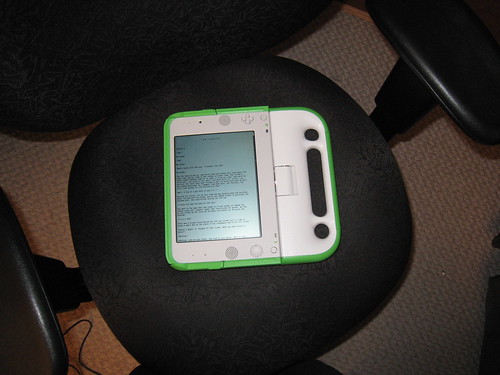
There is a pivot on the hinge, so the screen can flip around and fold down, allowing it to be used as an ebook reader or game (it has a D-pad and 4 buttons on either side of the screen).
Early prototypes had a crank on the side, perhaps the most distinctive feature. Unfortunately, that had to be dropped from the final design. Instead it has a standard power supply and rechargeable battery. The changer could be swapped out for a foot-driven charger or solar panels as a future innovation for places without power, although for internet they need a central server with power and phone, so most likely any classrooms using them will have power (though at home the child might not).
There are two speakers, a mic, and a webcam. The speakers seem fine, I listened to a clip I downloaded and it was easy to hear. In a noisy classroom, though, you’d probably want to use headphones.
The Software:
This is where things aren’t as great.
The software suffers from the same thing a lot of open-source software does – it’s largely written by software engineers who know little about graphic design and usability. Which means it’s functional, but not necessarily pretty.

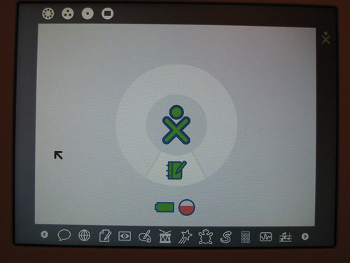
The interface as a whole is kind of clunky and cryptic. This may turn out to be fine in the field, where teachers and probably the students will get training on how to use it all. But in my opinion, the UI should be easy-to-use with little or no training.
The whole thing is similar to Squeak – a great concept, marred by terrible UI. Ok, maybe “terrible” is a bit of an overstatement, but it’s not pretty or easy-to-use. Thing is, many of the *concepts* for the UI aren’t bad, but the execution isn’t so hot. At first I thought this was because they were trying to create a language-neutral UI, but to use the UI, you hover over icons to see (in a text popup) what they are and what actions you can do to them.

Squeak Interface
Many software engineers actually scoff at “pretty” UI, almost like they think that to have good design is at the expense of functionality. The truth is, good software is a combination of both good functionality AND good design.
There are several bundled apps, which I’ll go over in another post. About a third of them are audio-related, part of a package called TamTam.
—
All in all, it’s not bad. It’s not the brilliant “oh my god how clever and amazing” that it *could* have been, but it’s at least a starting point. I would say at launch, the software is the weak part. Hopefully they can release some patches to address some of it (buggy touchpad, poor WPA support), but the biggest problem is the overall UI design. You can overcome that with training, but it’s a little disappointing that you would have to, one would hope it would be designed to be incredibly intuitive to use. Instead, it’s passible, but clunky.
Here’s one example of what I mean by clunky – in the news reader, i click on a BBC “learning english” exercise, which launches the web page in the web browser. The web page has an MP3 audio clip, i click on it, and a popup gives me the option to open it with a program. I select it, and it launches eToys, which launches a media player, which gives me a plain square box with the clip name, sliders for volume and shuttle. The player looked like it had been written in BASIC, a plain colored rectangle with plain rectangles for buttons. The whole experience lacks a consistant UI.
So right now, if I had to give it a grade, it would be:
Hardware: B
Software: C-
Overall grade: C
If they work some more on the software, the whole thing would be worlds better.
I am a great believer in the possibilities of programs like this, in Alan Kay’s vision for education. So as a first step, I applaud Negroponte for putting his money and influence where his mouth is. I just wish the XO1 could have been a home run instead of a base hit.